MKB Toegankelijk
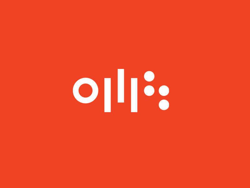


The branding is created with accessibility in mind. The logo is modern and lively, easy to read with clear elements. The three elements represent audio, mobility and kinetic which all have a relationship with accessibility. The logotype letterform conveys a clear aesthetic which is needed to be recognised effortlessly. The color palette has 2 complementary colors to amplify the high contrast necessary to make the content as visually usable as possible to individuals with low vision or varying levels of color blindness both on and offline. Each element can separately be used as icons and are designed to represent all parts of accessibility in a positive way.
