PPOServe

PPO Serve is a healthcare management company that provides a management system which helps medical practitioners manage maternity patients. They required a more user friendly platform.
The problem.
PPO Serve was initially designed without taking into account the various user behaviours and needs. It was difficult for users to complete tasks as the information architecture was very confusing.
My approach.
I created a UX strategy via interviews with stakeholders in order to understand all business goals and success metrics.
I performed an heuristic evaluation of the current system to identify usability problems.
I conducted contextual inquiries with nurses, doctors and admin staff regarding the current system.
The team and I then created an affinity diagram in order to order and analyse all research data.
We organised a co-design session, which included all stakeholders to focus our efforts and identify opportunities for a more usable design solution.
With the results from the co-design session we created basic wireframes and performed informal usability testing with our target audiences.
With feedback from the testing sessions we improved our wireframes and tested the higher fidelity wireframes once again.
Findings and recommendations from the testing were presented to the team and plans are in place to implement changes in development.
Major outcomes.
Feedback from users was very positive, in general they could all find the information they needed quicker and easier.
Some quotes included:
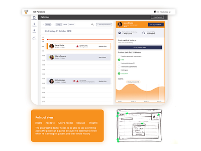
‘I Like the summary of the client from the calendar as it gives me a clear indication of what to expect from this case.'
‘I think it's much better compared to the one we using now.’
Changes are currently being implemented and I should start receiving user feedback on the live platform in the near future.