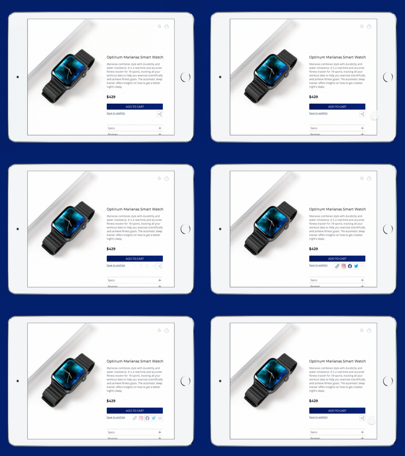
Daily UI 010 - Social Share
I wanted consider how the set social app icons might better fit within a minimalist website design without distracting from the product with their brand colors or cluttering the UI if they were left top level. Hence the interaction to uncover them from the share button. You could also support a large list of share options this way.
(Sorry for potato quality gif. Was on a machine without editing software today!)
More by Kori Loomis View profile
Like
