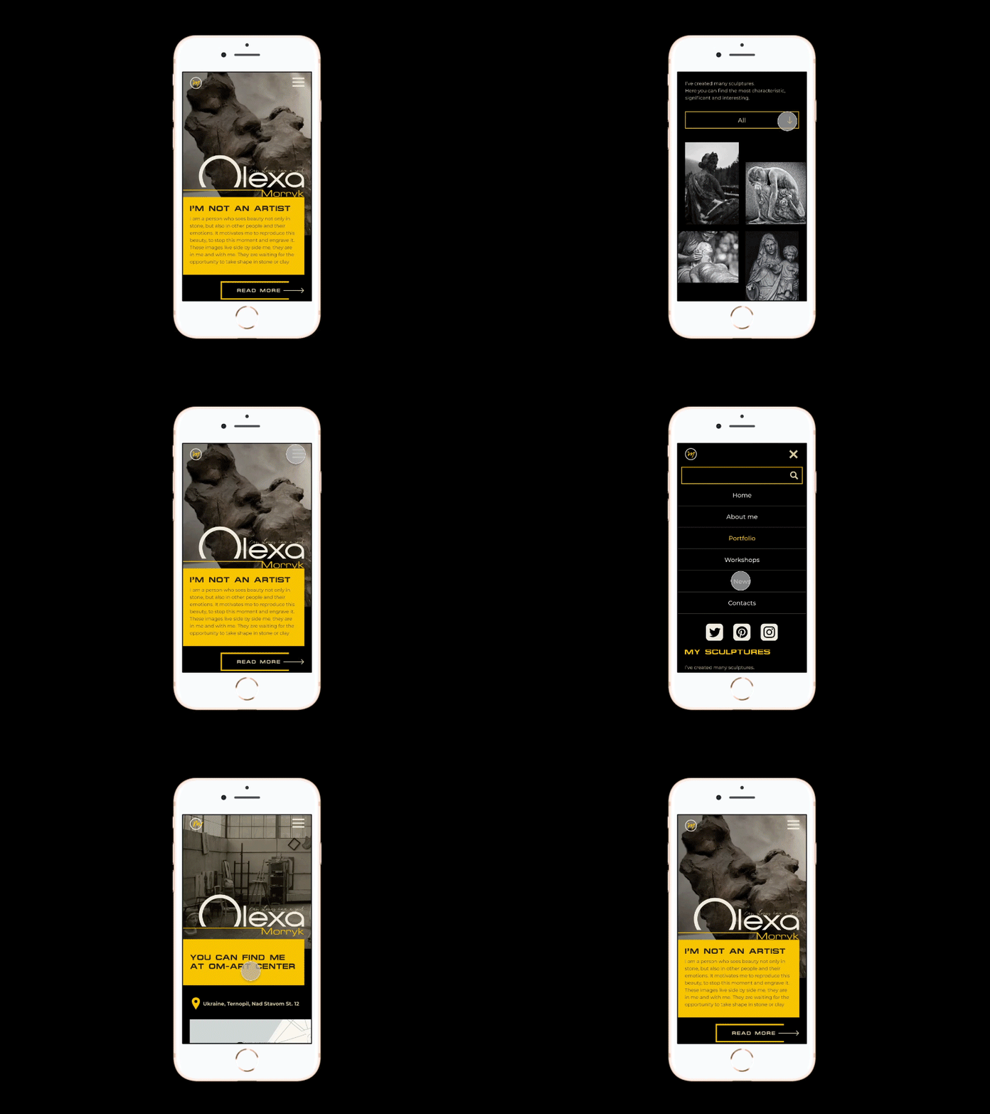
Adaptive. Website for a sculptor
Hi guys👋 Day #6 and my phone version (adaptive design) of website for a sculptor. The main goals were: - to make no clear order in such tight space - to squeeze many words - to make it user-friendly Think I dealt💪 . About shot. I blew up to make ae animation 😫 So I've: ✅ made interactive prototype in figma ✅ intalled OBS studio ✅ record screen ✅ converted, cut and speeded up video ✅ used ae to make psd sequense ... and now I'm thinking is it worth it?🤣🤣🤣 Hope it is! What do you think? . Thanks for you ❤ and feedback😊 to this project . About design idea of website for a sculptor on Dribbble https://dribbble.com/shots/15015763-Homepage-of-sculptor-s-website . Full project on Behance https://www.behance.net/gallery/104260229/Personal-website-for-a-sculptor . Get in touch markovska.ann@gmail.com
