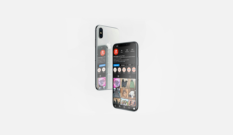
Warm Noggins Hat Co Logo and Branding
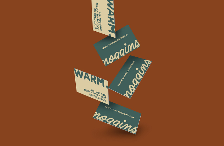
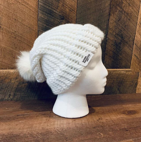
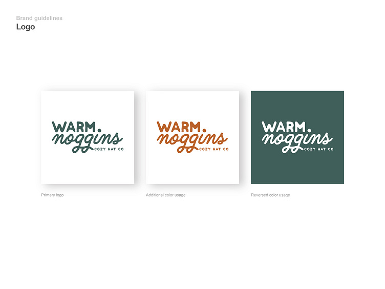
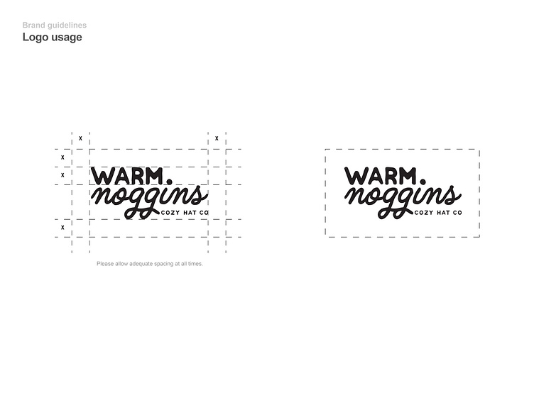
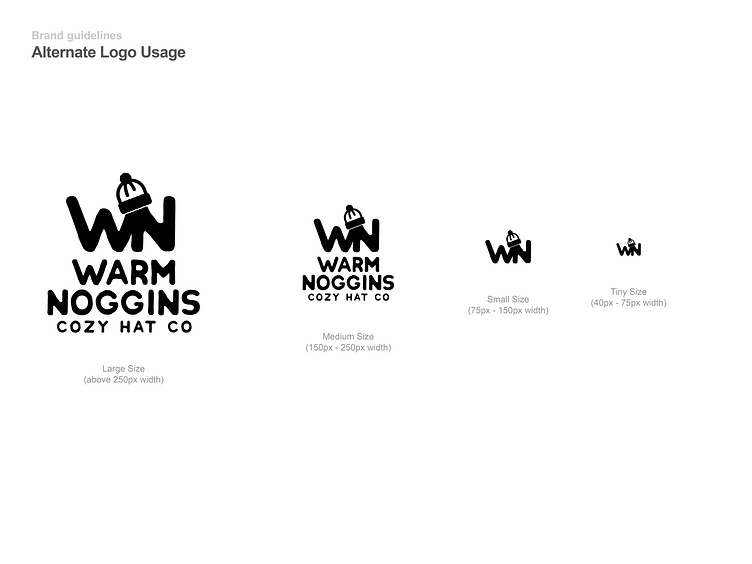
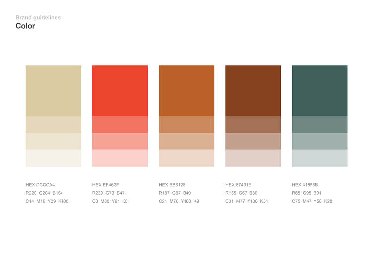
Warm Noggins approached me with an idea. An idea to bring a softer, more friendly feeling to their company. By incorporating rounder, smoother fonts and an autumn-inspired color palette, this is exactly what I did.
------ Let's work together! Contact me at chrisletterledesignco@gmail.com
Let's connect: chrisletterle.co | Behance | Instagram