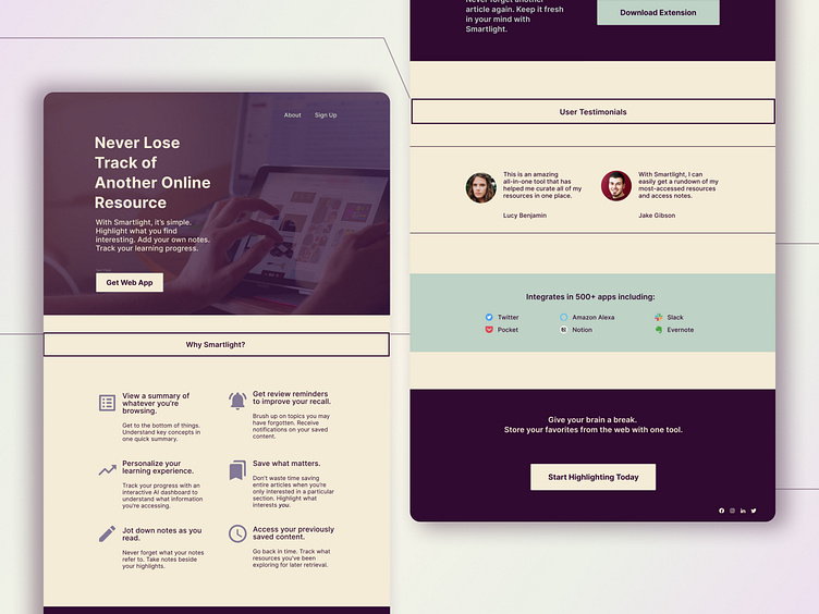
Smartlight Landing Page, version 2
The second iteration of the Smartlight landing page. A focus on minimalism and geometric shapes makes for a cleaner UI, while maintaining a sense of balance and visual hierarchy. Adjusted white space makes for a less cluttered interface.
More by Ewelina Adamczak View profile
Like
