PG / Spartan Helmet
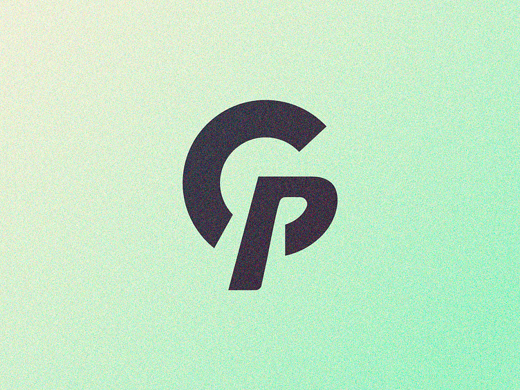
G and P letters combination not used in an ongoing project, kind of conveying the shape of a Spartan Helmet (abstract, very abstract...)
I think there's a little readability issue to see the G, may look a bit like a C I guess; that's why I've added two gaps between the P stem instead of just one (wich was way cooler imho).
Also tried to add a head serif detail on the G hook/P head, but seems too much to me (but also cool lol).
You can see more ideas at my sketching project
-
Also I'm available for new projects, so feel free for ask me! Need a logo, illustration or other crazy stuff? Email me now :)
-
Follow & Connect!
Behance • Instagram • Facebook • Twitter
-
Your opinion is important to me, And the constructive feedback highly appreciated
Despites this isn't an approved concept I'd love to hear your thoughts and suggestions :) Let me know what you friends think about it!
Best, BB