Redfin Blues Seafood Branding
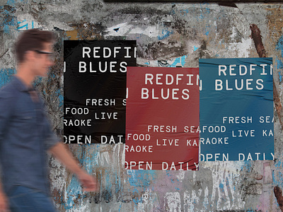


Redfin Blues is a nighttime hot spot for young adults. The new identity solved a handful of problems. By simplifying the old logo, but maintaining the same overall feel, it revitalized the restaurant but kept the brand familiar for all regular customers. At the same time, this attracts new customers with a simpler, more refined identity that is more appealing and easier to understand. The menu design has been arranged in a minimal layout to improve readability and comprehension. Alternate logos and typography were provided to be used across all social media and promotional channels.