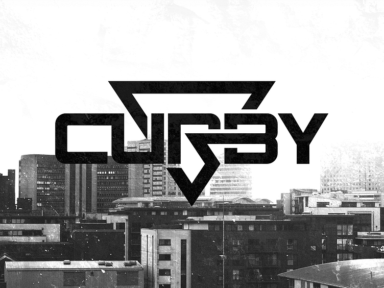
Curby UK Based Artist Logo Design
Logo Design for Curby, Birmingham Based Artist!
The original concept (which, if any of you follow me on Twitter, you'd have seen) was to create a design in the form of a partly eaten biscuit. This idea stemmed from Curby's unique pendant, which is in the shape of a circular biscuit, with his name sitting inside the design.
After creating this, we realised that this is an idea that wouldn't work given the limitations we had. The logo needed to be Black & White, and, with the idea being quite abstract, it just wouldn't work without being in full colour.
Going back to the drawing board, Curby had the idea of incorporating street elements within his logo. Something relevant to 'Road' whether it be tire marks or a road sign of sorts.
The design we landed on was in the form of a 'Give Way' road sign, the shape of which, purposefully chosen to tie in with Curby's style as an artist.
My goal was to bring these elements together seamlessly. To do this, I combined both a custom logotype and the road sign shape I had created earlier, creating one strong mark.
Thank you for viewing my work 💙
Want to work with me? Drop me an email at contact@penna.design Or visit my online portfolio here penna.design
