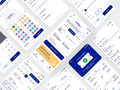
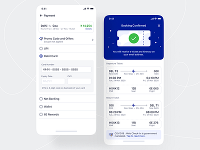
Flight Booking - iOS App Design
Lately, I did a design exploration for the complete booking flow for the top airline player - Indigo.
I aimed for minimal and functional design.
While designing the app interface, I was focused on HIG. However, I broke a few rules to extend the usability or match with the user’s mental model to reduce the cognitive load.
I had a strong eye on Hicks law to make sure the app is not cluttered and it only gives optimum options to the user. I extended usability by giving an adequate bounding space of 44x 44 for easy tap so that a user never taps accidentally on other elements.
I displayed information across different states to help users easily recognize details rather than recall while a cognitive walkthrough.
More by Nitish Khagwal View profile
Like


