Artificial Intelligence Solutions Page
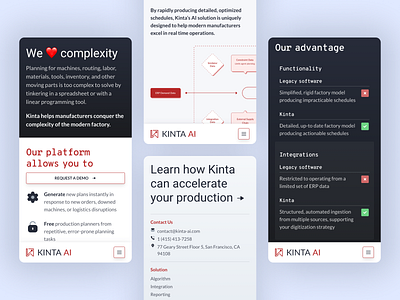
Optimised mobile layout for Kinta AI’s solutions page.
They had a few blocks on this page with images that had details in it that wouldn’t be viewable at mobile so one of the solutions was to make the image container scroll left/right thus making the image bigger.
Then I took the opposite approach for the table, instead of making that scrollable left/right I stacked it and grouped the content of each section together.
Need help with your project?
Get in touch 📮 hello@robsimpson.digital
More by Rob Simpson View profile
Like
