Instagram Stories Design
Keeping the Instagram Stories matched to the brand identity
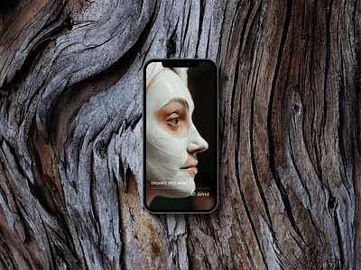
Designing the Instagram Highlights series for the Le Sens’ Instagram account, it was decided to select the pictures correspondent to the overall brand design. I tried to keep the similar corporate colors of pale green and hazy brown in the Highlights by picking up the pictures of similar shades. Such a decision will further affect recognizability of the company making the design memorable in the target group’s minds.
It’s also impressive how it was managed to showcase this exact Highlight - adding a bark of tree wasn’t a thoughtless decision. The Le Sens’ cosmetics is based on organic ingredients and so the color palette was developed to make an association with the nature, precisely, with leaves and trees. Thus, it was the best way to reflect the origin of the hazy brown color.
Have a project in mind?
Drop a line: contact@katezest.com
See my projects: https://www.behance.net/katezest
Follow me on Instagram: https://www.instagram.com/katezest.studio/
