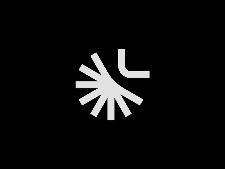
Sun-Protection Firm Mark
Hello design community! Hope you are having a productive week so far.
Rejected mark for a recent project, proposed for a firm that has 30 years of experience in production and installation of sun-protection equipment.
The company name starts with an "L" hence the L blocking out the shape of the sun.
I would love to hear your thoughts on the mark, what would you add or take away to make it look better? Comment your thoughts.
I also post stuff like this on my Instagram. If you want to follow link is below!
My Insta -> Click Here
The actual post -> Click Here
Have a great & productive day!
More by Mihajlo Tunev View profile
Like
