SendSpace Redesign
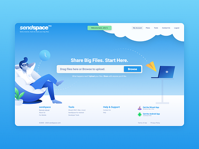


I use SendSpace for storing and sharing files because the service works well. However, their current website looks outdated and is unattractive. I was curious to see what its potential could be if its UI was updated nicely. I did not want to move things too much as the old interface (while being unattractive) was still, for the most part, intuitive and easy to use.
With this new redesign I feel it breathes new life into the brand while remaining familiar to its users. Hope you like it. By the way, you can view the company's current site on the last slide.
Would appreciate any feedback. Thanks for viewing!