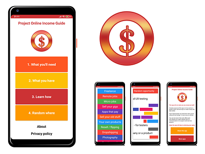
App design, UI/UX and branding not in that order
This app is related to money, opportunities, online stuff.
Logo was the starting point this time. I've created it before even think how the app would look like. It is all about money (dollar sign), online and opportunities - the big O, the circle around the money sign. Or a money sign supporting the cycle.
About the colors red and golden yellow are used blending in each other.
Once I have the logo made, I've turned to the UI. Hand draw the main screen rough look on paper, scanned with a phone and upload the sketch into a wireframing tool and I have the look of the app.
Next was to build the app main screen and everything else including other screens, transitions, button functionalities and finally get it done.
I didn't write a single line of code to build this app. It is build completely free with a free nocode tool.
Can get it on Google PlayStore: https://bit.ly/poi_guide_app
