Taur Archive


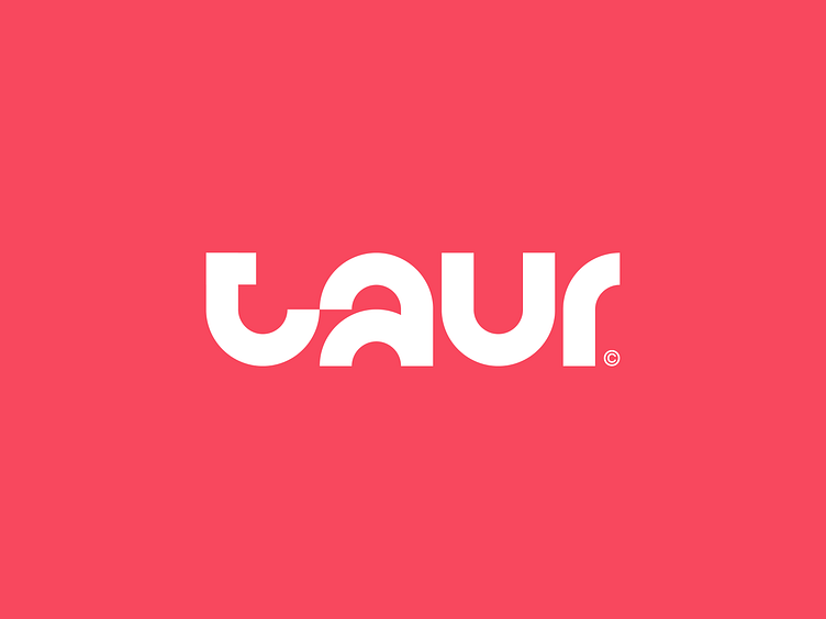


I had a few minutes today and decided to revive an archived logo created as part of a branding process for my client Taur Technologies.
Even though their current logo is awesome I really loved elements of this and could have definitely seen this work for them.
the curves made this logo really abstract and legible at the same time. It's crazy what you can do with a four letter word, straight lines and circles. It's why I love simple design.
You can check out the final product and logo they went with here: https://taur.com/
Interested in working together? Contact via email at: alex@aperios-design.co.uk Or via my website: www.aperios-design.co.uk
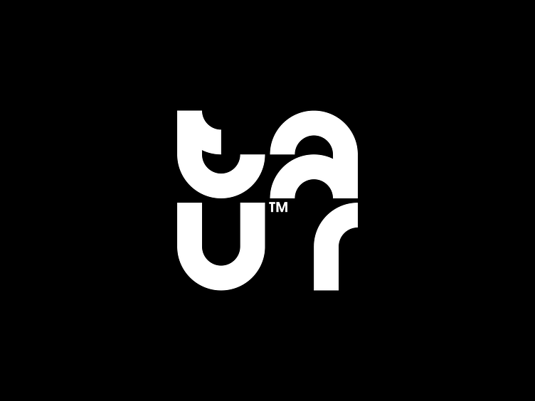
