#DailyUI 010
Helloo!
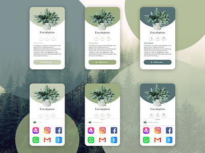
Day 10 of the #DailyUI Challenge: designing a social share button.
It was really interesting to learn more about that topic. It was also nice to use the social media icons in a design, I was tempted to change their color in order to match them with the color theme of the app, but I noticed that it wouldn't have been user friendly anymore. If the colors of icons like Instagram, Facebook, et change, a user would have to think more to recognize them, and making users think is not one of the usability rules.
"Don't make me think!" says Steve Krug.
Time for some attributions:
- the background picture is taken from Canva
- Instagram icon: Icons made by Pixel perfect from www.flaticon.com
- Facebook icon: Icons made by Freepik from www.flaticon.com
- Whatsapp icon: Icons made by Freepik from www.flaticon.com
- Gmail icon: Icons made by Freepik from www.flaticon.com
- Bluetooth icon: Icons erstellt von Freepik from www.flaticon.com
Hope you like it!
