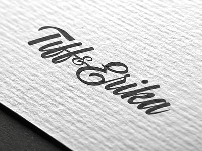
Tiff & Erika Logo
Created just for them, the Tiff & Erika mark is feminine and personal; it sits nicely under logos, and functions as a branded signature. Manipulation of Kaleidos Smooth to achieve the desired result. The ampersand echoes the shape of the E and the presence of both ascenders and descenders gives the logo design a pleasing balance. A signature that Tiffany and Erika can take with them on all future ventures.
Other shots from this project: https://dribbble.com/oakleycreates
More by Jenna Oakley View profile
Like
