Mini UI Tip - Emphasis
Emphasising certain elements in design is great because it allows a message to be conveyed in the right way and has a stronger effect. 👌
_
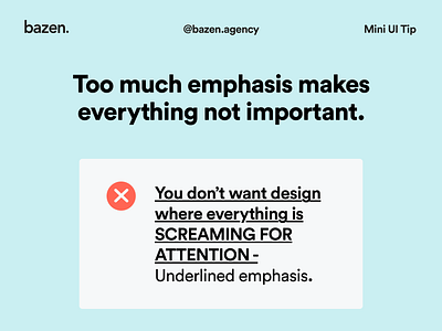
However, it is important to do this wisely. Using too many highlighting methods at once, such as underlining, bold text, capital letters, etc. and in too many places creates confusion and sends mixed messages in which, in the end, nothing seems important.
_
So be sure to emphasise only those parts of the message that are crucial. 🙃
More by bazen.talks View profile
Like
