Sneakers Store App
The team is available for new projects! Drop us a line: hello@purrweb.com | WhatsApp | Website
Hey-hey, guys! We’re happy to share with you the design we made for the Sneakers store app. It’s literally the app for buying new sneakers! 🛒
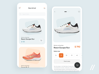
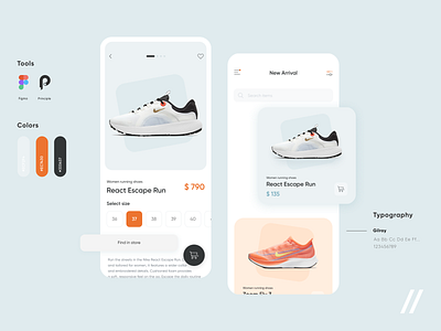
👟On the main screen there are new items and fresh arrivals. And there is a menu and filters. On the second screen — card of the shoes themself. You can look through the photos, look at the available sizes, check the product description. After it you can find the product in an offline store.
Pay attention to a basket that jumps very funny when you throw the goods into it! Ha-ha 😋
🔸The color scheme is muted with small orange accents. This is done in order not to violate the minimalistic style of the app.
🛍Cards matching the color of shoes quickly attract the attention of the buyer, and the product screens are clear and intuitive.
Press L if you like our design and share feedback!
Created by Polina Tolmacheva
PS We know to utilize UI/UX design to make users fall in love with a product. Check out how we used our skills to:
- raise $400k as capital for startup
- streamline cryptocurrency e-wallet
- reboot a Real Estate startup
- help newbies jump into investing
- conquer the chef freelance market
- simplify the life of event organizers
And that's not all — you can find more case studies in our Blog! 💜


