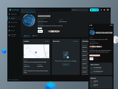
Assetlogue Dark Mode
After doing an inventory checklist of all the elements and all the colours used, I noticed we were using more than 16 different grey shades.
In trying to cut down, I planned to test and explore grey shades that would work well for the light and dark mode in the future.
Here is a list of things that I was going through to make sure I get the right type of shades:
• Accessibility was the number one priority
• Primary actions should stand out in both light and dark mode
• Use primary "Hue" in the grey tones to give some brand character to the grey.
More by Shremal Patel View profile
Like


