Simple Homepage for Online Course - Exploration
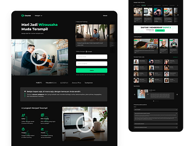
Delve into the world of UI/UX design with this Simple Homepage for Online Course Exploration.
In this project, I delve into layout experimentation and color tone exploration, focusing particularly on a dark theme.
Why dark theme? It's a conscious choice aimed at prioritizing user comfort and minimizing eye strain, especially considering the target audience – students and individuals seeking to enhance their knowledge through online courses. Join me as I craft a visually appealing and user-friendly interface that prioritizes both aesthetics and user well-being in the realm of online learning.
Interested to collaborate?
DM me on dribbble or email: gitetuko@gmail.com
