Text Field
Daily Design #10
Working on creating variable and responsive components with Figma's new auto layout and variable features.
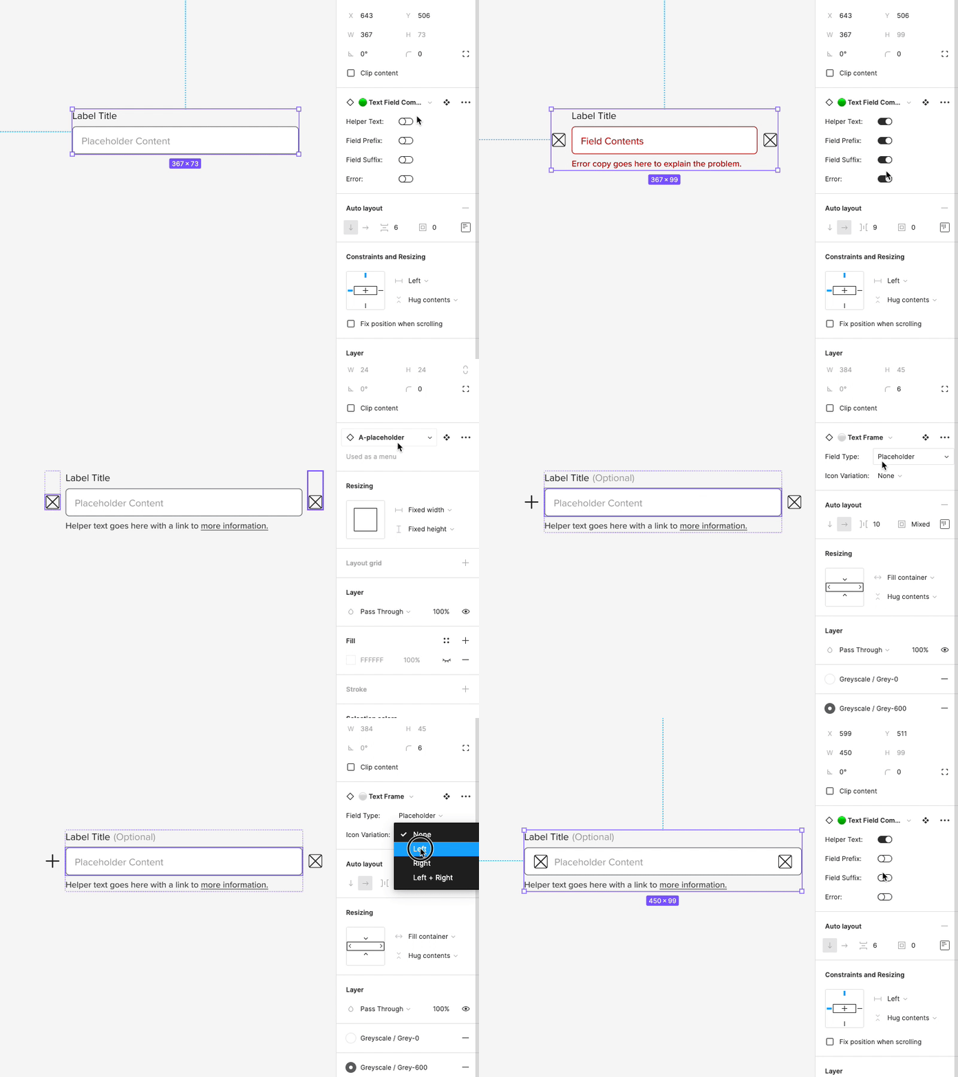
Text fields! One of the most utilized components, and definitely one of the most complicated to make. My goal was to put all of the variations that we have for the fields, labels, and the container itself into one variable component.
The field component itself includes several sub-components; The Field Box, The label, the description, and the prefix/suffix icons.
Within the label, it was built to be flexible enough for the designer to choose if it is labeled "optional" and even have a Show/Hide link for passwords. It also has all of the necessary states.
Within the field itself, the designer can choose to include icons inside the field (a common request and use case). The text within the field also flows off the edge of the field rather than going onto another line (single line fields do this).
The entire component is also 100% responsive (width) as well and works well inside an auto-layout stack.
