Switch
Daily Design #8 Working on creating variable and responsive components with Figma's new auto layout and variable features.
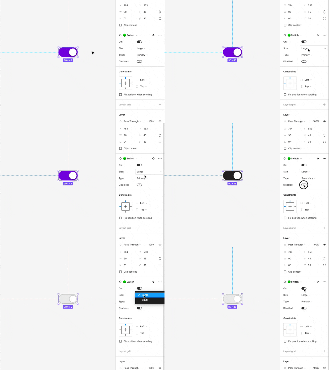
Short and sweet. This is the switch component, and has support for our different sizes, colors (Primary and Secondary colors) as well as differently designed states to better indicate when the switch is in the disabled state. In user testing it was common for people to not be able to distinguish between the "Off" state and the "Disabled" State. This design addresses it, though I believe it can be pushed farther by adding a check or X on the knob to better indicate the state. That testing will come soon though.
More by Hunter Paramore View profile
Like
