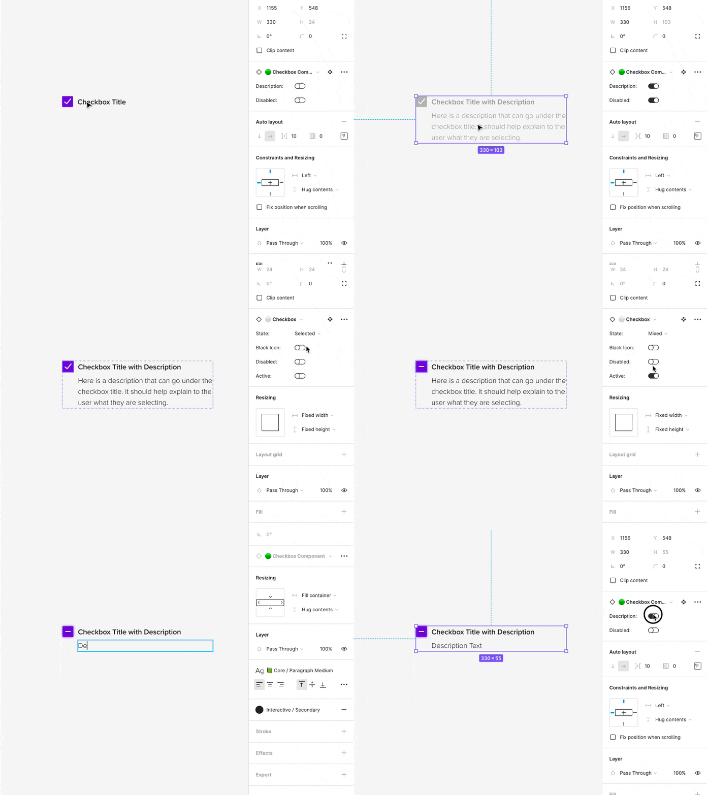
Checkbox
Daily Design #7 Working on creating variable and responsive components with Figma's new auto layout and variable features.
This one is super simple... yet is one of the most used in my opinion. A checkbox that has an optional description that you can enable under it. The entire component can also be set to the disabled state with one switch. It also works with both UI sets as we sometimes use the purple color for certain necessary things, and use the black one for others. The set is nested within itself, with the checkbox being its own variable component so that it can easily be changed to a different state.
The component is also responsive (width wise) and will grow in height automatically depending on the amount of content.
More by Hunter Paramore View profile
Like
