Logo Variations – JuPaJü Logo
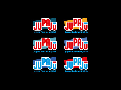
Just to show you a little bit more of my design process: Originally I created a strong line above the "u", like how you see it in this draft. But in the end, we switched the line to 2 dots to make sure that everybody understands that it’s about the letter "ü" from the cities name Jülich (see my last posts with the final logo). The fun part is, that the two dots of the final logo make the "u" to a happy smiley, which also fits very well with the youth parliaments message.