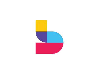
Breadcrumb - Case Study ✨
Thrilled to share my recent case study for Breadcrumb a learning app for children so they can enhance their existing knowledge and learn new stuff through a bunch of activities and libraries. ✨
Concept: The logomark is a combination of a trail, kids building blocks and the letter ‘b’. The building blocks refers to an important and common pastime of most kids while the letter ‘b’ alludes to the first letter of the app.
Last but not least, I must say that it is one of my best projects of 2019 in my perspective. Thanks to the team of Breadcrumb who chose me as their brand partner and gave me the chance to work on their brand identity.
Role:
— Art Direction
— Brand Identity
— Visual Identity System
Case Study:
https://effendydesign.com/breadcrumb
‣ Got interesting project in mind, do not hesitate to contact me on my website


