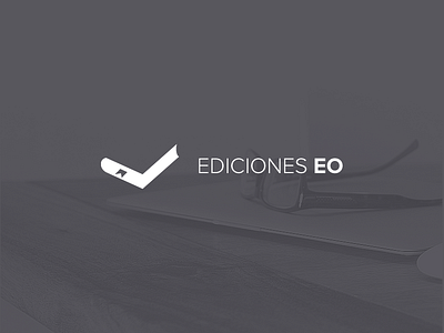
Ediciones EO pictogram
I was asked to make a new pictogram for a local book publisher. Total freedom. So I started from scratch trying to get a minimal book shape playing with negative space.
Lot of people can't see it at first glance. In fact, some of them see a "weird tick" But I don't think it was a failure. When I told them what it is, the overall reaction was very positive with comments like "oh, now I can't stop seeing the book!" or "funny!" :D
I must say the client didn't pick this option. But I think it was a good one.
See the attachment for a slightly different version.
More by Armando Sotoca View profile
Like


