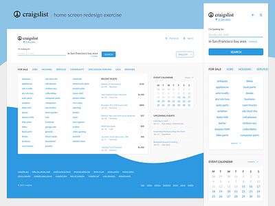
Craigslist - Home redesign
Recently I had to work on an exercise redesigning Craigslist's home page.
This was my approach, to main points:
- Give more importance to the search feature also a change in its language. Hoping the user can see clearly its capabilities.
- Board's lists hierarchy. A try to avoid overwhelming the user with all Craigslist's content.
------------------
I haven't done much design work the last year so it wast quite interesting working on this for a couple of days.
Probably not the best solution. What would you have done?
More by Abraham Guerra View profile
Like


