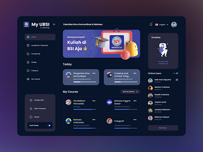
Re-Design University E-Learning
This started when I was studying at a university, and my experience during the lessons was a little uncomfortable, because the learning website had too many unnecessary elements.
From there I made the website redesign to be minimalist plus a dark theme 🌗, and of course the reduction of unnecessary elements 👌
Made with 💖 in Indonesia
More by Ade Ivan View profile
Like
