Mini UI Tip - How to use images
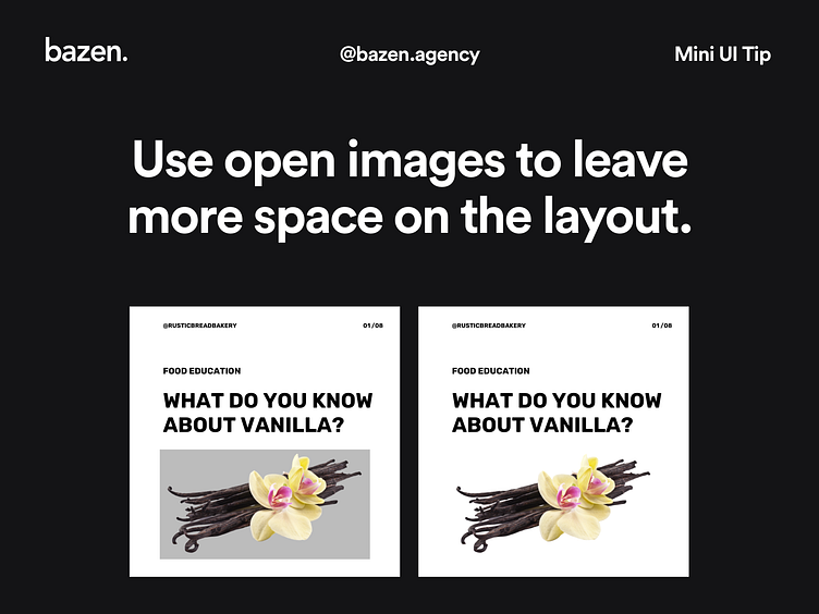
We know that negative space is very important to our design because it allows it to breathe.🧘🏻♀️ _ This is not only true when it comes to arranging elements on our posts, it can be applied when it comes to the elements themselves. When you use open space images, you do exactly that - you allow your design to breathe by leaving more space on the layout. _ Do you agree? 😊
Check out this post for more layout tips! https://dribbble.com/shots/13640953-UI-Tip-How-to-Create-Contrast-With-Shape
More by bazen.talks View profile
Like
