Alison Cosmetics
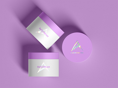
This logo was based on Brief by @LogoCore and I made it to practice my Design skill. I Created this holographic effect to make a premium feel of the product that it is placed on. I picked A bold font-face non-cursive as it was in the brief. Font-face name is TypoGraphica. As it is just a Face cream I thought there is no need to add anything else. Premium products do not look for attention by information on the packaging but by simplicity same as premium brands. They do not look to sell by advertisement on the shelf, they look for the right customer to join their tribe. 😊