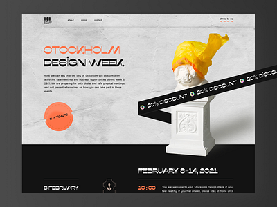
Stockholm Design Week // Website
Yo, Dribbble! 🤟
Hope this post will find you well and healthy. As we are staying at home during the lockdown and try to stay healthy and positive we have decided to cheer you up with a nice concept of the web site where we have used the reverse-contrast display typeface. Here we have tried to combine 2 fonts, which are: misto for the headings and gosha sans for the body text. The usage of minimalism and these colors are the perfect match. Would you like to see the dark theme?
With love, Blacklead Studio 🚀
Press :“L” to show some love 🖤
Interested to work with us? Send us message: hello@blacklead.studio
More by BL/S® View profile
Like


