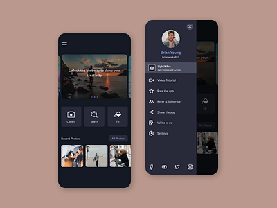
Hamburger Menu
I love experimenting with my designs but there are certain rules I like to keep in mind while designing a Hamburger Menu.
So, Here's A Short guide to designing Hamburger Menus:
- Left: The Route to the menu should preferably be on the left of the screen. Why, you ask? Native speakers of left-to-right languages tend to start with content left of the screen.
- Hierarchy: All the important navigation labels should be placed according to the hierarchy of importance.
- Profile Picture: Putting the profile picture of the user in the menu screen directly conveys that the options listed are related to the user’s account making the design more intuitive.
- Icons: Icons play a very important role in visually communicating the intent of the navigation labels. They being able to express the action instantly help the user absorb what's going on faster.
Hope you found this useful.
For business enquiries write at: muskanraina2505@gmail.com
