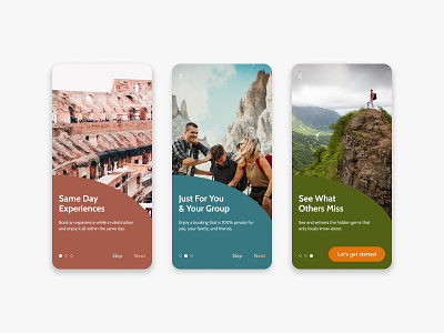
Daily UI 023 – Onboarding for Travel App
For this challenge I built a series of onboarding screens for a fictitious travel app.
I wanted to challenge myself by working with one primary colour per page. In doing so, I encountered some difficulty trying to pick a CTA colour that would be accessible for each of the screens. I settled with orange in the end.
Feedback is more than welcome!
Photo Credit:
https://unsplash.com/@stationery_hoe
https://unsplash.com/@kalenemsley
https://unsplash.com/@felixrstg
More by Raymond Chou View profile
Like
