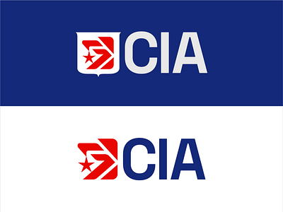
CIA Rebrand
Is your logo designed to stand the test of time?
The lifecycle of a timeless logo can be many years– decades even. In fact, some of the best logos, such as the Nike swoosh, have changed very little since their inception. But, eventually there will come a point where your brand may need to be refreshed.
While it’s typically unwise to rebrand based on general, current trends and popular styles, a redesign can be a great thing if your brand’s vision or mission has shifted, your target market has changed, or your products and/or services offered are now different. Another reason for a rebrand could be changes in advertising technology, such as a recent need for logos that consider motion graphics in advertising.
The old Central Intelligence Agency (CIA) logo had a very outdated feel. In early 2021, a new, black and white logo was revealed. While it is obvious that this logo is a bold departure from the prior one, you can be the judge of whether or not you feel this new logo fits the CIA brand.
I decided to have a go at redesigning the old logo, with these thoughts in mind: retain the eagle, create a version that uses the shield, keep the bold simplicity of the original text, and stick to red, white, black, and blue.
As for the look and feel, I wanted the refresh to feel formal and keep a traditional aspect while having a more contemporary, sleek appearance in order to appeal to the younger generation of CIA recruit candidates.
I hope you enjoy the results, and please let me know what you think! :)


