iOS 7 Home Screen Re-Redesign
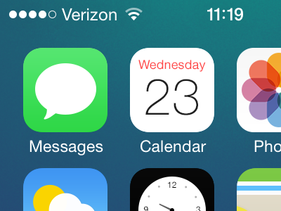


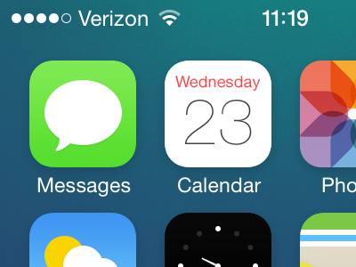
I feel less opposed to Apple's choices in these icon designs than when I first tried redrawing them.
This exercise was intended to adhere as closely as possible to Apple's original icons while offering only subtle revisions.
Apple's grid has slowly convinced me to be bolder with how tightly I space objects within the iOS icon canvas. I still think the official grid is *too* tight, but as you can see things are a lot tighter in this rebound than in my original redesign.