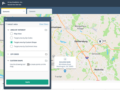
Map Data Filters Panel UI
Panel for inputs for our mapping and healthcare data application.
Solving for some problems we are running into from evolving our platform, where we currently use a sidebar nav plus an "input panel" for data filtering.
In this shot, I am working on an idea to propose the ellipsis in the Selections panel to be the way of switching focus so we can remove the left sidebar all together. Additionally, exploring the possibility of allowing user to move this around, while maintaining our current ability to collapse/minimize when not needed for more map real estate. Use of the map along with our data presentations (not pictured) is crucial for analysis.
More by Danelle Bailey View profile
Like
