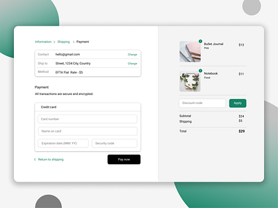
#DailyUI 002
Hello!
For the second day of the DailyUI challenge the theme was to design a credit card checkout form or page, and this is my result. I wanted a minimalistic and clean design, which is closer to the day to day real website experience. It was really fun to complete this challenge, I love the palette color and the pictures, which have been downloaded from Canva. Let me know what you think about it.
Thank you and I wish you a nice day :)
More by Deborah Stoleru View profile
Like
