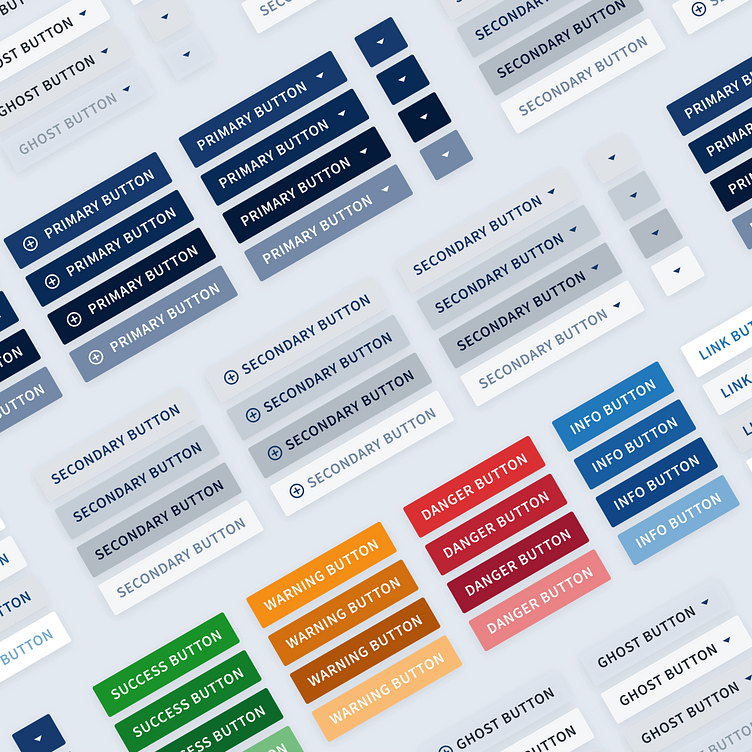
Unite Design System Buttons
As the main interactive building blocks in a user interface, the buttons in the Unite Design System are designed to clearly communicate their purpose, the actions they represent, and the status they are currently in. Each designed button has an idle, active/focus, pressed, and disables state Their color, shape, size, and padding respect and use the basic design language defined for the design system, and as such transfer the visual character of the brand within the digital interface. Their styles are designed to communicate the importance of action they represent - primary, secondary and tertiary actions, as well as communication-based styled buttons for success, warnings, danger, and information purposes.
With accessibility as a guiding principle, all of the button variations are designed to be easily perceived and understood by the users. In an idle state, primary buttons feature a contrast ratio of 11.29, the secondary 8.76, and ghost buttons 14.35, which is all well above the recommended 4.5 contrast ratio for AA compliance.
All of the buttons are designed with iconography in mind as well, allowing for text only, icon only, and combinations of text with icons at the right, left, or both sides.
