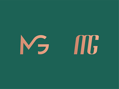
MG Monogram
Yep... More MG monograms.
More went unused, really love the shape and feel of the modern Sans design on the left. The other looked like a motorsport logo for some reason, again, a really cool shape but just not right for the brand. Really cool to explore and led onto another very cool concept that will be uploaded later....
Want me to design some awesome stuff for you too? Get in touch:
https://rupertharvey.com/contact
More by Rupert Harvey View profile
Like
