Modal Product Page Rebound
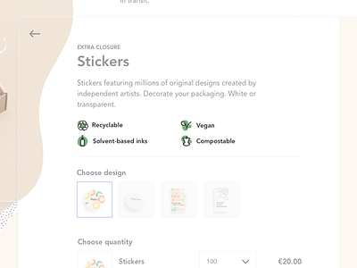
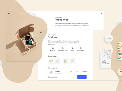
I loved the design in the original post of this modal product page and I wanted to explore a small change to the product features layout.
In the original shot, each product feature was on the same line. The icon was centered above the text.
My change is left aligning the icon and text of each feature and spreading them across two columns. I think this creates a slightly tidier layout.
What do you think about the suggested change?
More by Martin Berglund View profile
Like

