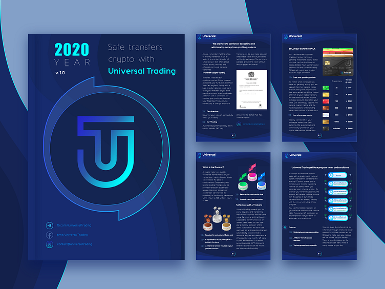
White Paper Design and Branding for Fintech Saas Web App
Hey, dribbblers!
We are pleased to share our print layout work with you. For us it was pleasant experience and we want to hear your opinion. Did we manage to convey corporate design in such a complex document as a white paper? Tell me how often you use illustrations for newspaper layout, how many columns for text do you think are optimal? We would love to hear your opinion about branding, identity design for startups.
Check out the full project on: Behance
Be sure to follow the @Extej team for regular updates. Do you have a project you’d like to collaborate on?
Feel free to contact us by: Email or TelegramDribbble | Instagram | Behance | Facebook
Thanks for your attention, we look forward to working with you. Your feedback is very appreciated! Don't be greedy and press "L" or ❤️ if love it. Feel free to feedback and comment

