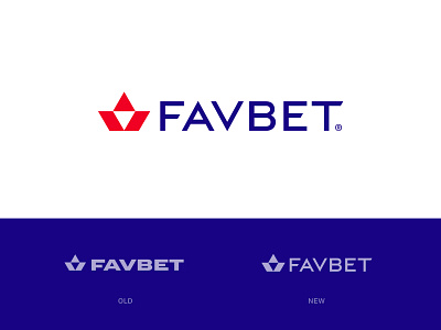
FavBet Redesign Concept
The idea for improving the existing logo of FavBet. The main thing was matching a type with mark. What do you think guys? I'll be grateful for your feedback :)
Looking for creative design solutions? We would like to help you! Feel free to client@precise.studio
More by Precise View profile
Like
