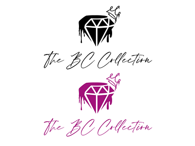
The BC collection logo (for client)
The BC collection is a brand that sells minks/lashes, purses/handbags, stylish sunglasses, and clothing. This was the final draft that was agreed on.
Originally the client only wanted to focus on logos that showed highly detailed lashes but considering the variety of products they planned on selling maybe something that more broadly represents urban style and luxury would be great.
Main inspiration came from diamonds and graffiti and eventually after many sketches a dripping stylized diamond and crown fit perfectly.
As for color the client was set on a mixture of pink, magenta black/white for the different colors the logo would appear in (but I just stuck to 2 colors for the shot here.
Font: (Houstiny Slant) The client specifically asked for cursive type fonts and based on what they were providing I wanted to pick something that felt a bit more exclusive and a thinner lined font helps with that. (typically ill show a grid of at least 5 to 10 varieties of fonts (or sketchbook drafts) for them to pick from)
