Primrose
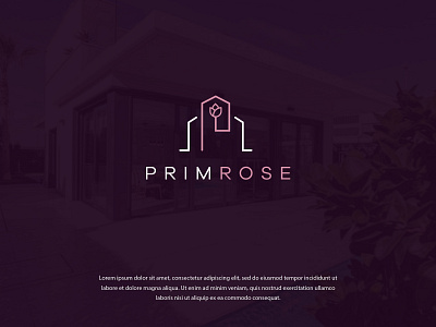
This is a cool identity design for a high-end real estate company. Adding a rose to the picture was the client's choice and it was also a must-have for the logo. However, the real challenge was to use it with elements of the respective industry in a way that it didn't look boring or irrelevant. We invested a lot of time and effort into making this remarkable fusion of a rose with a building structure. The elegant text added more value and made everything feel bold and cohesive. 🌷🌷🌷
*Ps. The brand initial P can also be spotted in the icon.
_____________________
Press “L” to show some ❤️
Are you looking for a logo (re)design for your business?
I’d be happy to hear your story! Feel free to reach out!
More by FullStop View profile
Like
