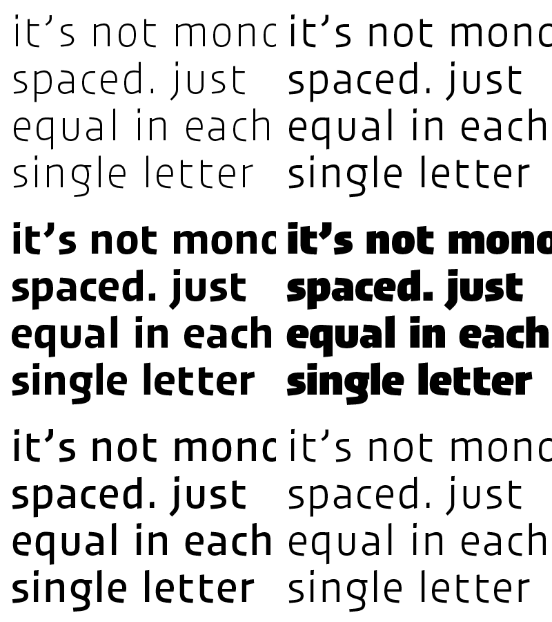
not mono but duplex
@Henric Sjösten: the typeface is not actual a mono spaced one. just each letter share the same with in every weight.
@Ondrej Jób: Great to hear your bold weights are getting narrower sometimes — in the beginning, for me it was quite curious to have the light slightly more extended than the slightly narrow black weights and to see the spacing of the black kind to tight. For me it was as well the black 'i' who dictates the complete family spacing and shaping.
More by Jakob Runge View profile
Like

