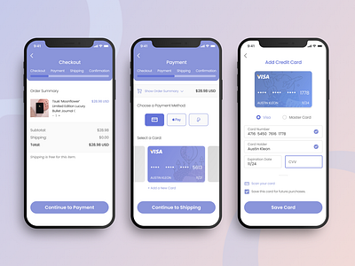
DailyUI 2 Credit Card Checkout
Hello All!
Daily UI Challenge#2
Today’s Theme: Credit Card Checkout
I received a really cute bullet journal for Christmas and decided to apply a stationary store checkout for this challenge!
My general process is to identify the business brand, understand who I was designing for and make assumptions about my users to inform my design decisions.
*Disclaimer: While I am aware that Apple Pay has specific rules based on the Human Interface Guidelines, I have overruled it at this time because the nature of this design is purely conceptual and wanted the branding to look more consistent.
---
If you’re interested in ordering this type of bullet journal, you can order them from Notebook Therapy. (Not sponsored, lol.)
Hope you like it! :-)
More by Mae Nakajima View profile
Like
