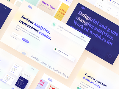
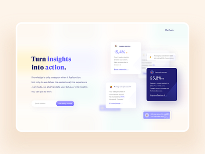
June website • sections layouts
Hi all ! ✌️
I'm very happy to share with you some more designs of June's website, following the previous shot ! I've been working on this website design with Didier @ eFounders Startup Studio 🎉
These screens are a preview of the website landing page, showing bits of the branding and visual identity, and mixing explorations + final versions of the different sections. The full landing page design and visual identity was created, wireframed, and envisioned from the ground up, with the help and guidance from June's team.
***
June is a San Francisco based and French product analytics startup, on a mission to empower B2B SaaS product teams to better understand user behavior, foster growth and revenue - all while keeping their daily focus. June's product analytics tool generates keen, blazing fast insights and custom-built reports. It makes them dead simple to understand, by anyone ; no coding needed as well !
The goal of this collaboration was to create an identity reflecting June's playful and modern mindset, enhancing their game-changing vision, beautiful product and easiness of use. And above all, conveying their product's sharp and cutting-edge functionalities.
***
Can't wait to share you more on this awesome collaboration ! More on this soon, stay tuned ! 🙌
👉 Curious ? 👀Check out June to find more on their product and mission 🔥👷🏼♂️


