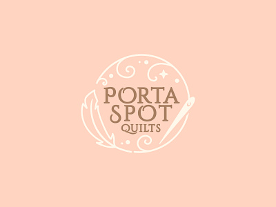
PortaSpot Quilts Icon
Every once in a while you are confronted with the most fun, and yet challenging branding brief. In this case: PortaSpot Quilts. When I first heard the name I immediately thought of porta-potties. It’s a natural connection, and the shop owner expressed concerns over this association as well. However, as we delved into the history of where the name came from, I found that it was an issue that we could solve with some strategic design choices.
The solution? Lean into the concept of the brand. The name PortaSpot came from two locations. The first was a play on the owner’s son’s name, Porter. The other, came from the idea that quilts are these magical portable squares that you can use to create a special place no matter where you are. Suddenly, that was it! That was the element we needed to focus on: this idea of a magical spot. The owner, Sarah, crafts more than just blankets, so I didn’t want to rely too heavily on the idea of quilted blankets. Instead I turned her sewing needle into a magic wand of its own, and gave a magic touch to the threads coming out of it.
The feather was a nod to down blankets, and nature. Sarah’s son, Porter, loves exploring the great outdoors and she wanted her brand to capture some of that innocent awe that comes from seeing the world through a toddler’s eyes.


